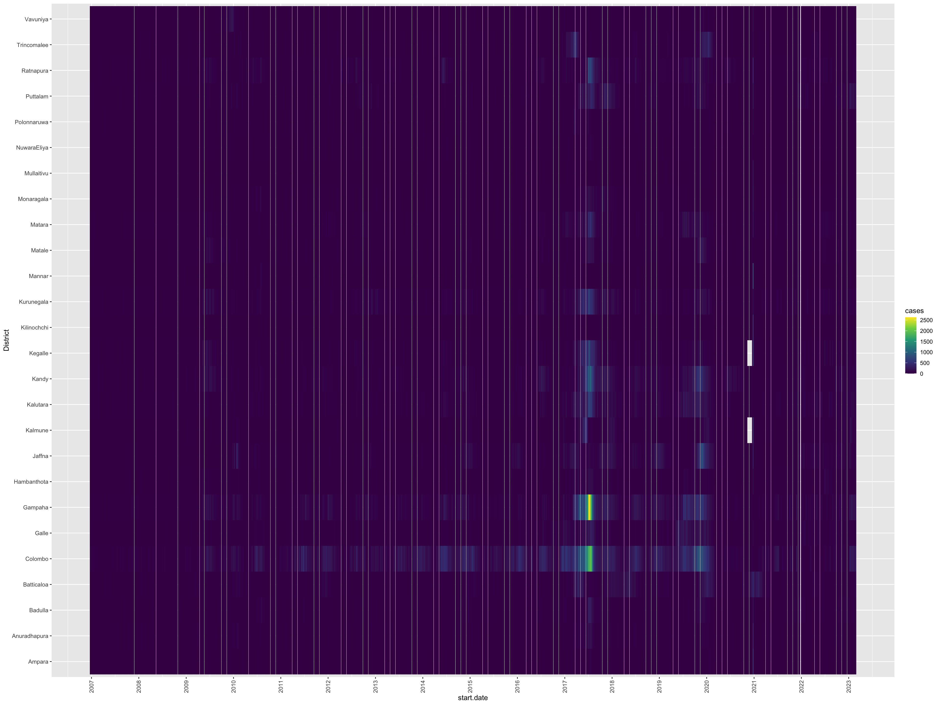
Visualizing multiple time series can be a challenging task due to issues like overlapping and scale differences. One popular approach to visualize all time series in a single plot. This visualization can be useful in identifying the dominating districts in terms of dengue outbreaks.
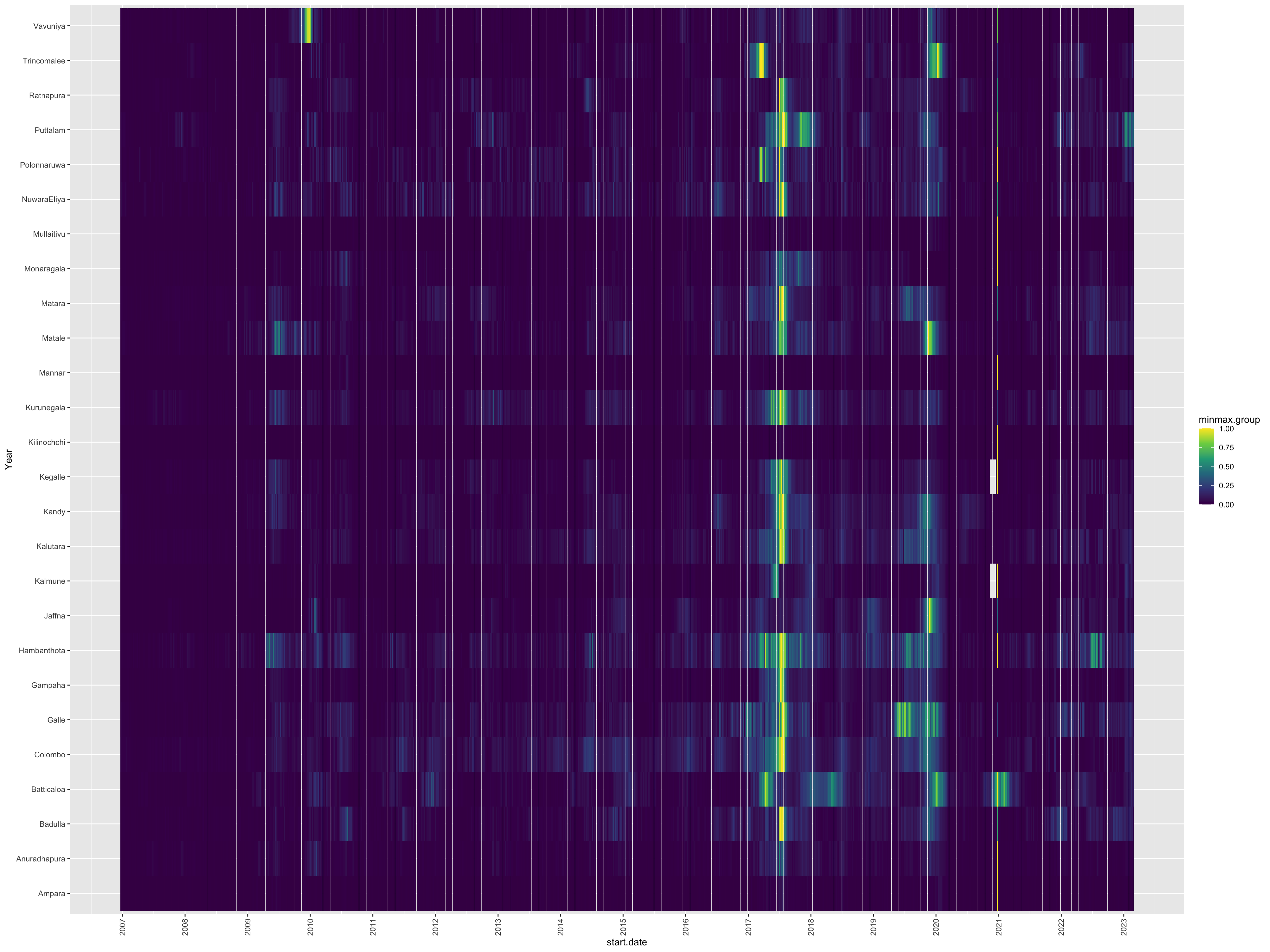
However, relying solely on the above plots can sometimes make it difficult to identify whether all districts have a similar pattern or not. For instance, it may not be immediately clear whether the peak periods of all districts are similar or not. To overcome this challenge, we can apply a min-max transformation to each series based on its minimum and maximum values. This can help us to compare the patterns across different districts more easily, and gain insights into the temporal dynamics of dengue outbreaks in Sri Lanka.
The min_max function with the parameter local=TRUE helps you easily normalize the series using the min-max transformation with respect to each series minimum and maximum value.
Apply min-max transformation using min_max function
Step 1: Apply min-max transformation
srilanka.minmax <-min_max(srilanka_weekly_data, variable.to.minmax="cases" , local =TRUE, group.var="district")srilanka.minmax
# A tibble: 25,766 × 9
# Groups:   district [26]
    year  week start.date end.date district    cases min.group max.group
   <dbl> <dbl> <date>     <date>   <chr>       <dbl>     <dbl>     <dbl>
 1  2006    52 NA         NA       Colombo        71         0      1972
 2  2006    52 NA         NA       Gampaha        12         0      2631
 3  2006    52 NA         NA       Kalutara       12         0       703
 4  2006    52 NA         NA       Kandy          20         0      1062
 5  2006    52 NA         NA       Matale          4         0       260
 6  2006    52 NA         NA       NuwaraEliya     1         0        85
 7  2006    52 NA         NA       Galle           1         0       332
 8  2006    52 NA         NA       Hambanthota     1         0       147
 9  2006    52 NA         NA       Matara         11         0       489
10  2006    52 NA         NA       Jaffna          0         0       931
# ℹ 25,756 more rows
# ℹ 1 more variable: minmax.group <dbl>