library(denguedatahub)
library(ggplot2)
library(maps)
library(magrittr)
library(viridis)
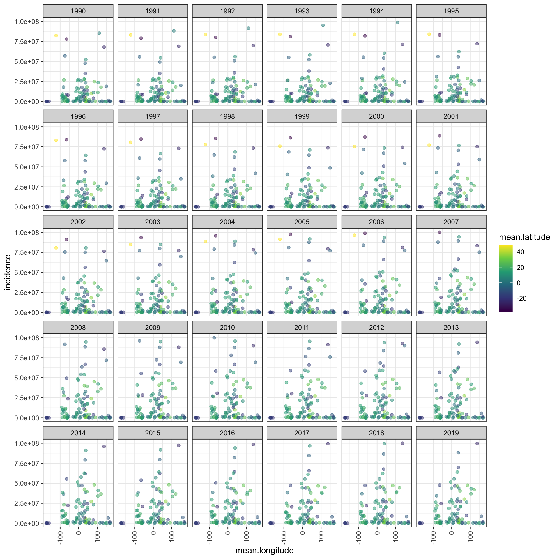
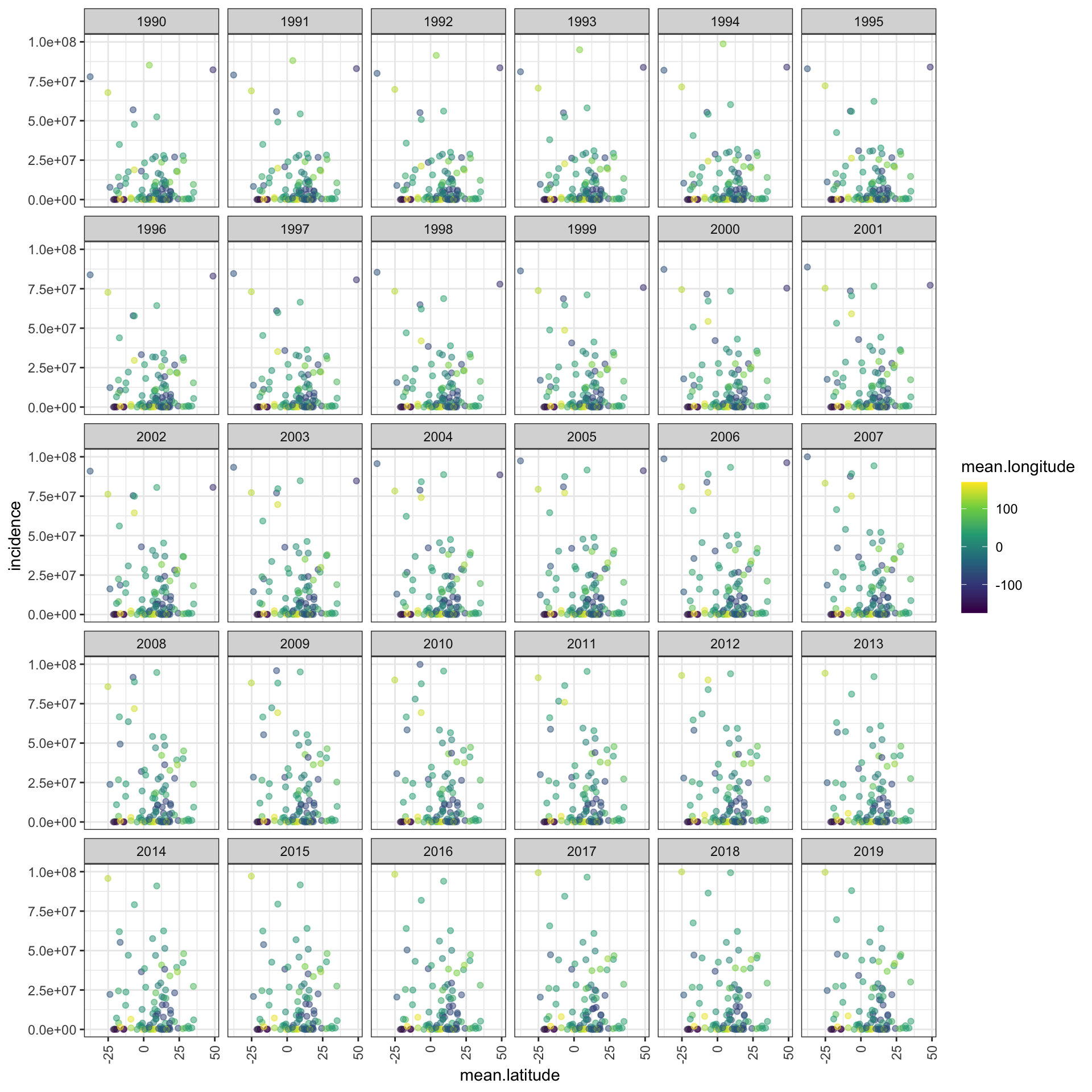
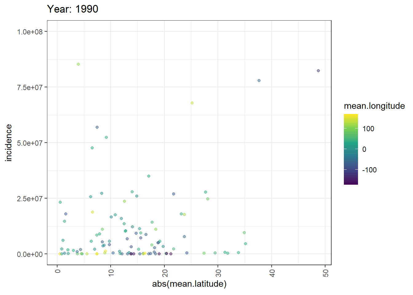
# Filter for the year 2019
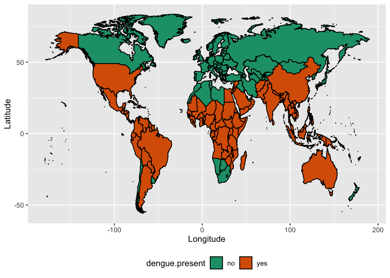
worlddata2019 <- dplyr::filter(world_annual, year == 2019)
# Enhanced plot with caption
ggplot(worlddata2019, aes(x = long, y = lat, group = group, fill = factor(dengue.present))) +
geom_polygon(color = "black") +
coord_fixed(1.3) + # Ensures correct aspect ratio
scale_fill_viridis_d(name = "Dengue Presence", labels = c("No", "Yes")) + # Using viridis for better color representation
labs(
title = "Global Dengue Distribution in 2019",
subtitle = "Presence of Dengue Virus Reported by Country",
x = "Longitude",
y = "Latitude",
caption = "Author: Thiyanga S. Talagala, Source: https://denguedatahub.netlify.app/world.html" # Adding caption
) +
theme_minimal() +
theme(
legend.position = "bottom",
plot.title = element_text(hjust = 0.5, size = 16, face = "bold"),
plot.subtitle = element_text(hjust = 0.5, size = 12),
axis.text = element_text(size = 10),
axis.title = element_text(size = 12)
)